A Closer Look at Uninsured Rates
August 10, 2017
research R healthcare health accessWhile looking at ways to examine the issue of healthcare access at a national and local level, I stumbled upon the Robert Wood Johnson’s County Health Rankings Data. During the exploratory data analysis phase, I noticed that there was what appeared to be a marked dip in the rate of the uninsured population from 2013 to 2014, so I wanted to capture some of these findings to share as I explore further.
Load the County Health Rankings data
trends <- read.csv("~/CHR_TRENDS_2017.csv")

# change yearspan to year; makes it easier to work with
trends <- rename(trends, year = yearspan)
Given that the original RWJ CHR .csv file was 37 MB, I used write.csv() to create a smaller .csv file using only the data I’ll be working with in this analysis to push to the site. Having said that, I’ll still go through how I had to do it originally.
trends <- read.csv("~/CHR_TRENDS_2017.csv")
trends <- rename(trends, year = yearspan)
state_uninsured <- trends %>% filter(countycode == "000", statecode != "00", measurename == "Uninsured")
write.csv(state_uninsured, file="state_uninsured.csv")
Filtering to only examine State level data
As you might’ve guessed, the County Health Rankings data presents the data on a county-wide level. Since at this stage, I was more interested in State data, I just used filter() to exclude the county data. Initially, I had planned on using the contains() function in stringr, but I noticed state and national data were listed as having ‘countycode’ of “000”, so I just filtered based on that (as seen below).
state_trends <- trends %>% filter(countycode == "000", statecode != "00")Look only at only “Uninsured” data (for now)
The County Health Rankings offers a rich set of health-related data, including healthcare costs, diabetes screening, rates of STIs, and other health factors, such as obesity, rates of inactivity, but I just wanted to focus on Uninsured rates for now.
unique(state_trends$measurename)

state_uninsured <- state_trends %>% filter(measurename == "Uninsured")
Visualizations
First let’s start with a boxplot to show the dip from 2013 to 2014.
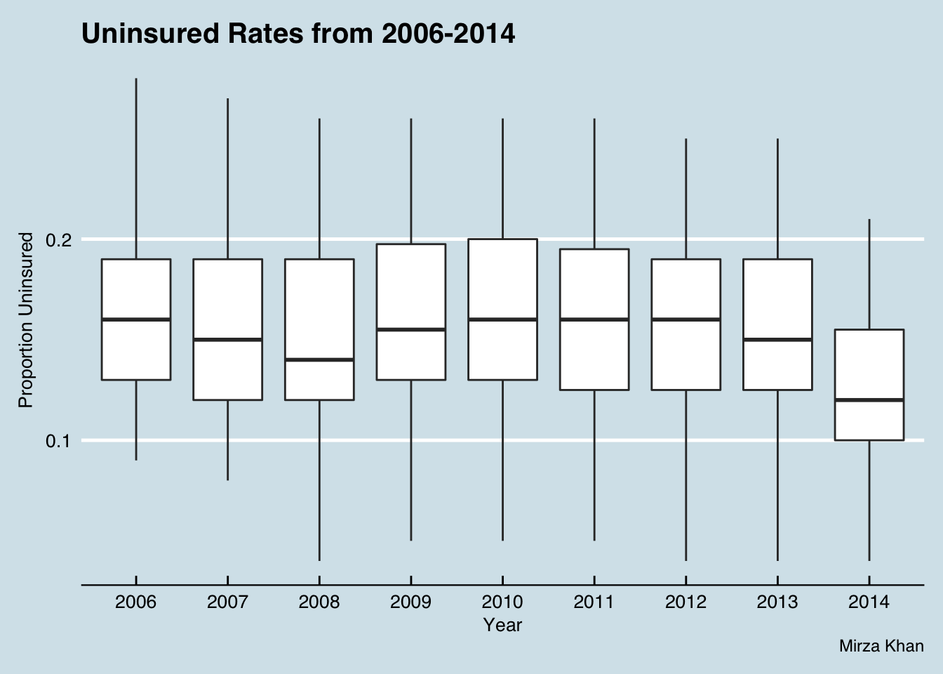
Here you can appreciate the dip from 2013 to 2014 in the uninsured rate. There also appears to be a minor dip in 2008 as well.
In order to get the
htmlwidgetsto work nicely withblogdown, I had to use thewidgetframepackage. You can read more about it here.
This may not be the prettiest looking visualization, but it allows for an interactive view by state over the years. What I’d like to point out is Massachusetts – it goes from 0.1 in 2006, to 0.08 in 2007 before dropping to 0.04 in 2008. Of note, “Romneycare” was signed into law in 2006.
A Closer Look at 2014 Uninsured data by State
I could’ve, and probably should’ve, faceted out each figure, particularly the maps to show the trend, but I think the ones above, probably do so with a lot less clutter. The remaining figures focus just on the 2014 data, which is the most recent year for which we have data at the time of this writing.
I think the outliers at both extremes are far more apparent presented in this bar graph compared to the scatterplot previously shown.
Roll out the map
I feel like when dealing with this kind of data, it just begs for a map. In my other post on Primary Care Physicians per capita, I used ggplot() to generate the map. As seems to be the case in R, there are several packages that can help you perform tasks, and that applies for chloropleths as well. Some options include plotly, leaflet, highcharter, and googleVis. This time I used highcharter.
First, I used get_data_from_map() to do exactly what you’d think it would do for the US. Then, I took a sneakpeek of the map data to see how I could get this data set to play nicely with the 2014 State Uninsured dataset I have.
mapdata <- get_data_from_map(download_map_data("countries/us/us-all"))
head(mapdata)
At my disposal was the state names, listed in full, e.g. Iowa, and by state code, e.g. IA. It also provided the fips code, e.g. 19 for Iowa. I tried to generate the map using the fips codes at first, but for some reason a handful of the states didn’t color in, but I had success using the hc-a2 column from ‘mapdata’ (which appears to be the same thing as the postalcode column).
h3 <- hcmap("countries/us/us-all", data = uninsured_2014, value = "rawvalue",
      joinBy = c("hc-a2", "state"), name = "Proportion Uninsured",
      dataLabels = list(enabled = TRUE, format = '{point.name}'),
      borderColor = "#FAFAFA", borderWidth = 0.1,
      tooltip = list(valueDecimals = 2, valueSuffix = " ")) %>%
  hc_title(text = "Proportion Uninsured by State in 2014")
frameWidget(h3)
EXTRA: Let’s create a similar chart of Health care costs by State in 2014
I’m sure they normalized the healthcare costs, but I have to go through their methods and see how exactly they did this.
health_costs_2014 <- trends %>% filter(countycode == "000", statecode != "00", year == "2014", measurename == "Health care costs")

hchart(health_costs_2014, "column", hcaes(x = state, y = rawvalue)) %>%
  hc_add_theme(hc_theme_smpl())