Control Charts and Run Charts
September 11, 2017
howto R research tutorialControl Charts and Run Charts
I was introduced to Control charts (aka Shewhart charts) today, and I figured that this could be done rather simply in R. There were a couple of packages that seem to do this well, namely qcc and qicharts. Unlike qcc, qicharts appears to utilize ggplot2 and so I find the visualizations to have a nicer aesthetic. I did find a post that does show how to generate a qcc control chart with ggplot2. The author made the package available on GitHub if you’re interested. As an aside, the author of the qicharts package has a nice post on examples of the package for generating Control charts.
Who is Shewhart? Walter A. Shewhart helped to develop and refine the process control methodology while employed at AT&T (“Ma Bell”) in the 1920s, and published the “bible” of the field, Economic Control of Quality of Manufactured Product. He is also the man behind the Plan-Do-Study-Act (PDSA) cycle and the Hawthorne Effect.
I’ll try to practice with Control (Shewhart) charts here to get more comfortable as I try to incorporate this into my Exploratory Data Analysis (EDA) workflow.
Definitions
- Common cause variation – random variation or “noise” that is inherent to the process itself. If variation is common cause alone, the process is considered stable and predictable.
- Special cause variation – when one or more data points vary in an unpredictable manner due to some factor(s) that is not inherent to the process. If a special cause is present, it signals that the process has been changed.
Control, aka Shewhart, charts help to distinguish common cause vs special cause variation.
- Trend – a long series of consecutive increases/decreases in the data, i.e. at least 6 or 7 points are all going up or all going down.[^carey]
- Run – series of points in a row on one side of the median, i.e. crossing the median line counts as a new run.
Generate Data
I’ll try to find a nice open dataset to play with this concept later, but for now I’ll just simulate some data to work with.
library(qicharts)

set.seed(1)

x <- rnorm(24)
y <- c(rnorm(mean = 5, 12), rnorm(mean = 4, 12))
Run Chart
Run charts are very simple and don’t require any sort of statistical analysis. You also can construct a run chart using different types of data, such as counts, percentages, ratios, etc.
#qic(x) #generates a run chart of x
qic(y) #generates a run chart of y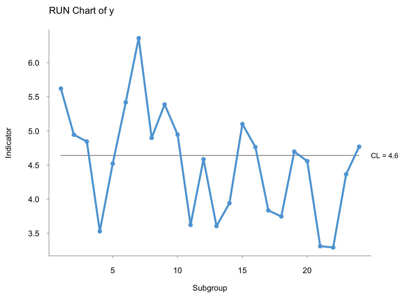
Ideally, you should have at least 16 points (excluding those on the median) to have enough statistical power to identify a special cause.[^carey] Perla, et al. puts this number at 10.
Rules to Interpret a Run Chart:[^perla] 1. Shift – 6 or more points either all above or all below the median. Values on the median do not count towards this tally. 2. Trend – at least 5 points that are all going up or all going down. If 2 or more values are the same, only count the first point and exclude the repeating values. Of note, Carey puts the number of points at 6 or 7 to qualify as a “trend.” 3. Runs – series of points in a rown on one side of the median. Trick to count the number of runs: tally the number of times the line connecting the points crosses the median and add \(1\). 4. Astronomical Point – the blatant outlier
Figure 3 of Perla’s 2011 paper, The run chart: a simple analytical tool for learning from variation in healthcare processes, does an excellent job of visually illustrating these principles.
Control Charts
You’ll notice that an obvious difference between control charts and run charts is the addition of 3 lines – the median and the upper and lower control limits. The upper and lower control limits are NOT the confidence interval. What’s the difference? The confidence interval describes the variability of a distribution of data, whereas the control limits describe the variability of a process. This is a subtle point, but an important one to know. Furthermore, a point that falls beyond the control limit is considered a special cause, rather than an outlier with confidence intervals. Additionally, the formulas used to calculate the standard deviation for confidence intervals and control limits is different.
Rules to Detect Special Cause:[^carey] 1. At least 1 point beyond the control limit (UCL or LCL), i.e. greater than 3 standard deviations (\(\sigma\)) 2. 2 out of 3 consecutive values are both: a) on the same side of the mean, and b) more than 2 \(\sigma\) away from the mean. 3. 8 or more successive values lie on the same side of the centerline (mean). 4. Trend of 6 or more successive values steadily increasing/decreasing.
Refer to Figure 2.2 and pgs 16-17 of Carey’s Improving Healthcare with Control Charts for more.
Choosing the “right” control chart
There are a few control charts to choose from, and while it seems daunting at first, all you need to really do is understand your dataset and reference a decision tree algorithm.
- Are you working with continuous or discrete variables?
- If you’re working with discrete data, are you working with binary, e.g. 0 or 1, data – examples include death (yes/no), infection (yes/no)?

Although not shown in the figure above, if working with a continuous variable and \(n = 1\), you’ll want to use an i-chart (aka XMR chart).
P-chart
Used when working with count/discrete data where data are collected as “nonconforming units,” i.e. is dichotomous or binary. The \(y\)-axis represents the proportion/percentage, e.g. deaths (yes/no), C-sections (yes/no), re-hospitalization (yes/no), etc.
Surgical Complication Dataset
I will use Duclos and Voirin’s data from their paper to create an example P-chart.
library(rvest)
library(qicharts)
library(qicharts2)
library(qcc)
library(dplyr)

# Scrape the table from the site
surg_table <- read_html("https://academic.oup.com/intqhc/article/22/5/402/1786749/The-p-control-chart-a-tool-for-care-improvement")

surgcomp <- surg_table %>% html_table()

# Clean up
surgcomp <- surgcomp[1]
surgcomp <- as.data.frame(surgcomp)
colnames(surgcomp)
## [1] "Month" "No..of.complications"
## [3] "No..of.surgical.procedures"surgcomp <- surgcomp[1:30,]
# rename the columns for simplicity
surgcomp <- rename(surgcomp,
month = Month,
complications = No..of.complications,
surgeries = No..of.surgical.procedures)
surgcomp$month <- as.integer(surgcomp$month)
glimpse(surgcomp)## Observations: 30
## Variables: 3
## $ month <int> 1, 2, 3, 4, 5, 6, 7, 8, 9, 10, 11, 12, 13, 14, 1...
## $ complications <int> 14, 12, 10, 12, 9, 7, 9, 11, 9, 12, 10, 7, 12, 9...
## $ surgeries <int> 105, 97, 115, 100, 95, 111, 68, 47, 83, 108, 115...Here is how the P-chart looks using qicharts.
# with qicharts
qicharts::qic(complications,
              n = surgeries,
              x = month,
              data = surgcomp,
              chart = "p",
              main = "P-chart for Surgical Complications",
              ylab = "Proportion of patients",
              xlab = "Month")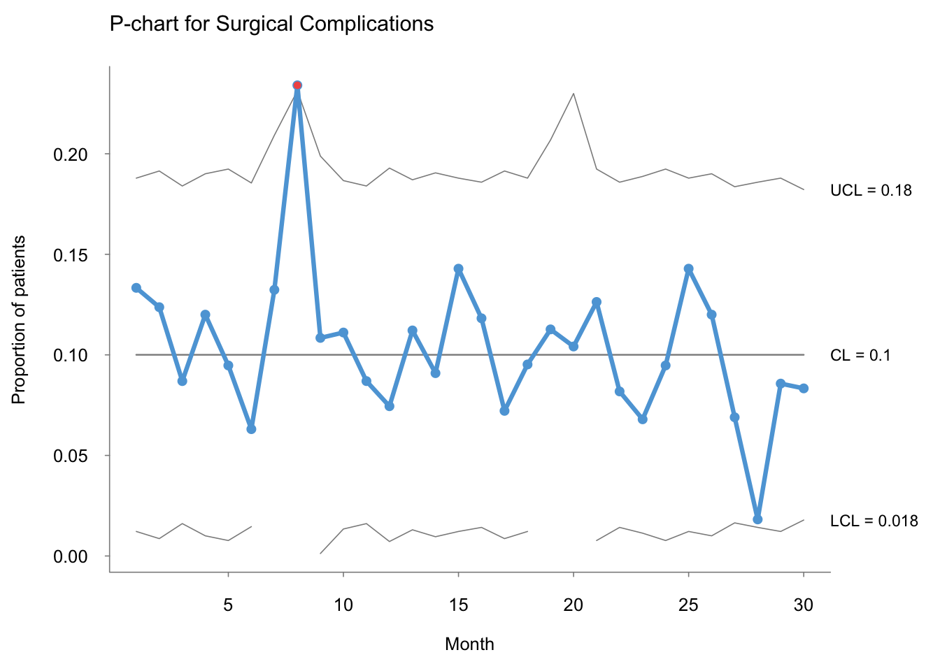
I learned today that qicharts is no longer in active development, but the author has moved on to the next phase (literally) with qicharts2.
Here is the same P-chart made using qicharts:
# with qicharts2
qicharts2::qic(complications,
               n = surgeries,
               x = month,
               data = surgcomp,
               chart = "p",
               title = "P-chart for Surgical Complications",
               ylab = "Proportion of patients",
               xlab = "Month")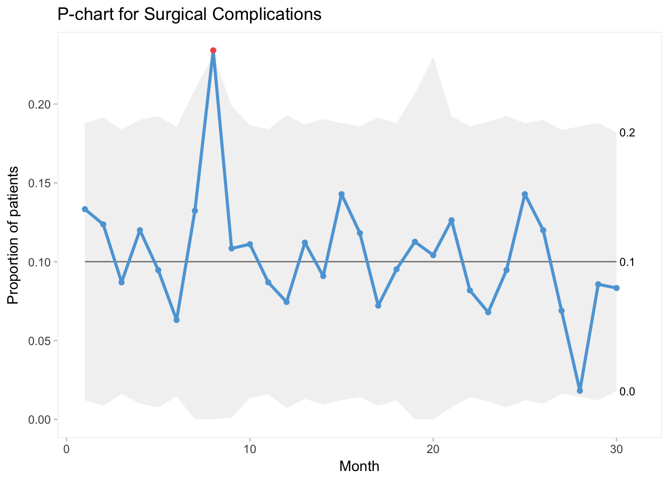
Lastly, let’s use qcc to generate our P-chart:
# with qcc

qcc(data = surgcomp$complications,
    type = "p",
    sizes = surgcomp$surgeries,
    title = "P-chart for Surgical Complications")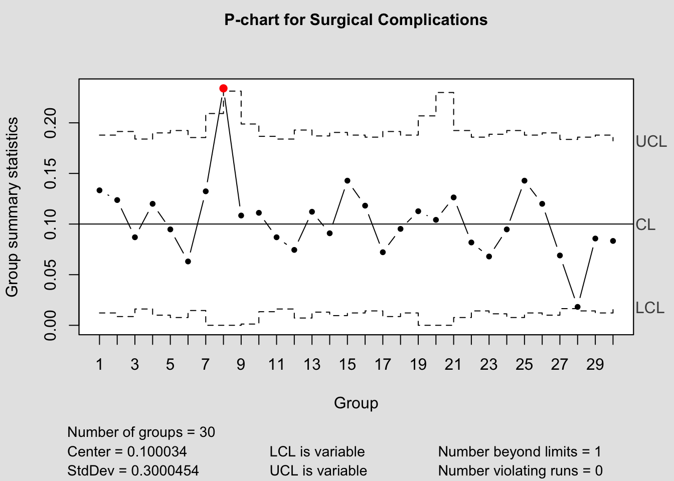
## List of 11
##  $ call      : language qcc(data = surgcomp$complications, type = "p", sizes = surgcomp$surgeries,      title = "P-chart for Surgical Complications")
##  $ type      : chr "p"
##  $ data.name : chr "surgcomp$complications"
##  $ data      : int [1:30, 1] 14 12 10 12 9 7 9 11 9 12 ...
##   ..- attr(*, "dimnames")=List of 2
##  $ statistics: Named num [1:30] 0.1333 0.1237 0.087 0.12 0.0947 ...
##   ..- attr(*, "names")= chr [1:30] "1" "2" "3" "4" ...
##  $ sizes     : int [1:30] 105 97 115 100 95 111 68 47 83 108 ...
##  $ center    : num 0.1
##  $ std.dev   : num 0.3
##  $ nsigmas   : num 3
##  $ limits    : num [1:30, 1:2] 0.01219 0.00864 0.0161 0.01002 0.00768 ...
##   ..- attr(*, "dimnames")=List of 2
##  $ violations:List of 2
##  - attr(*, "class")= chr "qcc"
Although the graph itself seems old school, especially when compared to qicharts, I do appreciate the inclusion of the summary statistics alongside the plot.