# Let's rename the columns to make the data easier to work with

NRMP_data <- NRMP_data %>%
  rename("year" = "Year",
         "specialty" = "Specialty",
         "us_applicants" = "US Applicants",
         "total_applicants" = "All Applicants",
         "total_positions" = "Positions Offered",
         "total_programs" = "No. of Pgms",
         "us_matches" = "US Matches",
         "total_matches" = "All Matches",
         "us_matches_percent" = "% US Matches",
         "all_matches_percent" = "% All Matches",
         "us_ranked_positions" = "US Ranked Positions",
         "all_ranked_positions" = "All Ranked Positions",
         "unfilled_spots" = "Unfilled Spots",
         "salary" = "Salary",
         "satisfaction_overall" = "Overall",
         "satisfaction_income" = "Satsfied Income",
         "satisfaction_medicine" = "Satsfied Medicine",
         "satisfied_specialty" = "Satisfied Specialty")

## Notice that you misspelled Satisfied for income and medicine. Nice going.

# Crap, I noticed that Pulm has 5 different names

unique(NRMP_data$specialty)
# Reviewing the data and NRMPs collection, I should have 3

NRMP_data$specialty[NRMP_data$specialty == "Pulmonary Disease and Critical Care"] <- "Pulmonary Disease and Critical Care Medicine"
NRMP_data$specialty[NRMP_data$specialty == "Pulmonary Disease and Critical"] <- "Pulmonary Disease and Critical Care Medicine"

unique(NRMP_data$specialty)
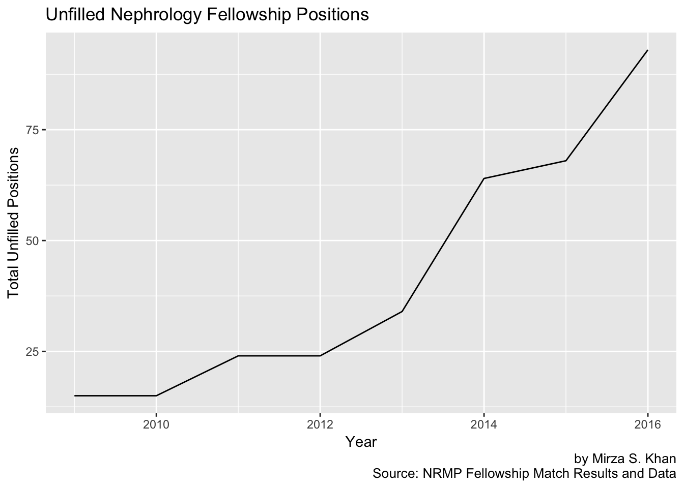
# Let's make a plot looking at Unfilled spots in Nephrology fellowships over time

unfilled_renal <- NRMP_data %>% filter(specialty == "Nephrology") %>% select(year, unfilled_spots)

unfilled_renal %>% ggplot(aes(x = year, y = unfilled_spots)) + geom_line() + labs(title = "Unfilled Nephrology Fellowship Positions",
    x = "Year", y = "Total Unfilled Positions", caption = "by Mirza S. Khan
Source: NRMP Fellowship Match Results and Data")
# Unfilled spots across different specialties

unfilled_all <- NRMP_data %>% select(year, specialty, unfilled_spots)

unfilled_plot <- unfilled_all %>% ggplot(aes(x = year, y = unfilled_spots)) +
  geom_line(aes(color = specialty)) + theme(plot.subtitle = element_text(vjust = 1),
    plot.caption = element_text(vjust = 1)) +labs(title = "Unfilled Positions by Specialty",
    x = "Year", y = "Total Unfilled Positions",
    colour = "Specialty", caption = "by Mirza S. Khan
Source: NRMP Fellowship Match Results and Data")

ggplotly(unfilled_plot) %>% layout(showlegend = FALSE)
## The above plots the absolute number of unfilled positions by specialty, but perhaps we may be able to glean more information
## by looking at the ratio of Unfilled Spots by Total Positions available

div_unfill <- 100 * (NRMP_data$unfilled_spots / NRMP_data$total_positions)

div_unfill <- cbind(NRMP_data, div_unfill)

ggdiv <- div_unfill %>%
  ggplot(aes(x = year, y = div_unfill)) + geom_line(aes(color = specialty)) +
  labs(title = "Unfilled Fellowship Positions by Specialty",
    x = "Year", y = "Unfilled Fellowship Positions / Total Positions (%)",
    colour = "Specialty", caption = "by Mirza S. Khan
Source: NRMP Fellowship Match Results and Data")

ggplotly(ggdiv) %>% layout(showlegend = FALSE)
# What you see here is in absolute terms, Nephrology has more unfilled positions, but
# ID has a greater proportion of unfilled spots between the 2 in the more recent data
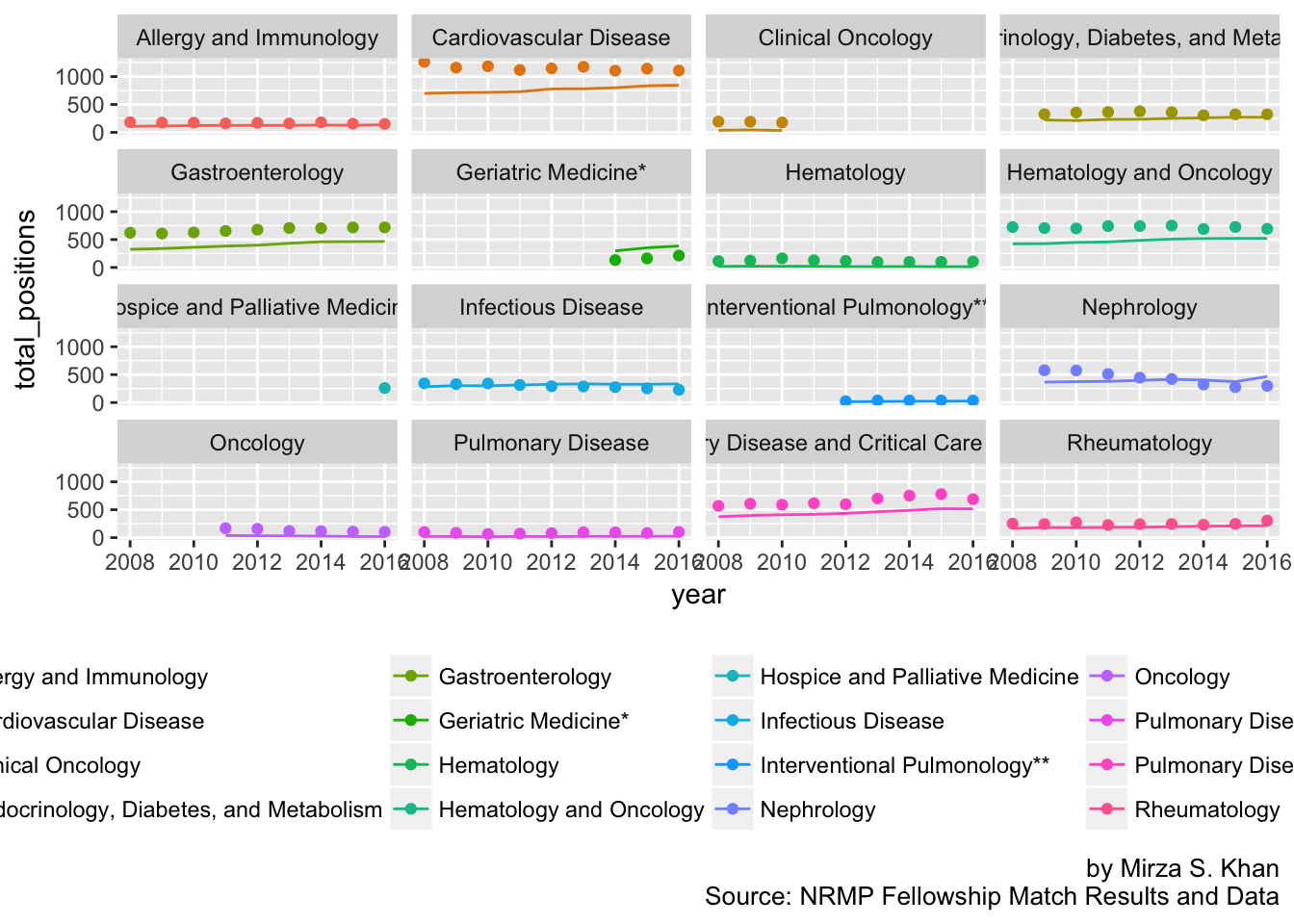
# Let's look at the total number of positions available and see if this has changed
# Has the demand for fellowship positions translated into changes in supply?
# Supply = total_positions and Demand = total_applicants
unfilled_ratio <- NRMP_data %>% select(year, specialty, unfilled_spots, total_positions, total_applicants)
unfilled_ratio %>%
ggplot(aes(x = year)) + geom_line(aes(y = total_positions, color = specialty)) +
geom_point(aes(y = total_applicants, color = specialty)) +
facet_wrap(~specialty) +
theme(legend.position = "bottom") +
labs(caption = "by Mirza S. Khan
Source: NRMP Fellowship Match Results and Data")
# Create a new variable showing the difference in total applications and total positions
# If Supply > Demand, we will expect a negative value and associated positive unfilled positions

delta_filled <- NRMP_data$total_applicants - NRMP_data$total_positions

NRMP_data <- cbind(NRMP_data, delta_filled)

table(NRMP_data$delta_filled < 0) # There are 12 times where Supply > Demand
# Wow, they have 78 different "specialties", let's just filter out the ones we need

med_subs <- c("Allergy & Immunology", "Cardiology", "Critical Care Medicine", "Endocrinology", "Gastroenterology",
              "Geriatrics", "Hematology & Medical Oncology", "Hypertension & Nephrology", "Infectious Disease",
              "Medical Oncology", "Palliative Care", "Pulmonary / Critical Care", "Pulmonary Disease",
              "Rheumatologic Disease")

salary <- salary[salary$Physician.Specialty %in% med_subs,]

# Rename to make it easier to work with, and to help w/ merge later

salary <- salary %>% rename("specialty" = "Physician.Specialty", "salary" = "Median.Physician.Compensation.Data")

# Convert salary from chr to numeric and drop the $ and ,

salary$salary <- gsub(",", "", salary$salary) # remove the ,
salary$salary <- gsub("[[:punct:]]", " ", salary$salary) # remove the special char, $
salary$salary <- as.integer(salary$salary) # convert salary to integer (from char)

salary$year <- rep(2016) # to add a year = 2016 column

salary
# Next steps:
# 1. Convert subspecialty to be corresponding name in the NRMP data frame
# 2. Filter for year == 2016 and exclude the other salary column for 2016
# 3. Use merge(NRMP_2016, salary, by = "specialty") to combine them