Map Making: PCPs per Capita
July 10, 2017
howto R research tutorialI wanted to use this opportunity to work with R markdown, especially since I plan on collaborating with others on this.
As part of my research on health care access, I wanted to create a map to visually represent the number of doctors available on a state level. I came across the AAMC’s 2015 State Physician Workforce Data Book. Their site also has a nice interactive visualization that reminded me of some of the work I’ve done using highcharter in R.
Getting the data
I started out by scraping the data from the AAMC pdf linked to above. I then opened this up in R and cleaned it up a little.
library(tidyverse)
library(ggplot2)
library(maps)

#Load the CSV file
PCP <- read.table(file = "AAMC_PCP.csv", sep = ",", dec = ".", header = TRUE)

#Change States to all lowercase
levels(PCP$State) <- tolower(levels(PCP$State))
Going from State to lat, long coordinates
#Generate geocoords corresponding to each state
map_it <- map_data("state")
This will generate state data in geographic coordinates. For example:
##        long      lat group order  region subregion
## 1 -87.46201 30.38968     1     1 alabama      <NA>
## 2 -87.48493 30.37249     1     2 alabama      <NA>
## 3 -87.52503 30.37249     1     3 alabama      <NA>
## 4 -87.53076 30.33239     1     4 alabama      <NA>
## 5 -87.57087 30.32665     1     5 alabama      <NA>
## 6 -87.58806 30.32665     1     6 alabama      <NA>
Merge State with ‘Region’ and Coordinates
As you can see above map_it generates a data frame that contains our coordinates and each state is listed under the ‘region’ column.
#Add a new column called "region" to help merge coords data w/ each state
PCP$region <- PCP$State

#Remove US, PR and DC
PCP <- filter(PCP, region != "united states" & region != "puerto rico" & region != "district of columbia")


#Merge the States (from PCP) with the Coordinates data set, map_it
PCP <- merge(map_it, PCP, by="region")
Map Making
ggplot(PCP, aes(map_id = region)) +
  geom_map(aes(fill = PCP$PCP_percap), map = map_it, color = "white") +
  expand_limits(x = map_it$long, y = map_it$lat) +
  scale_fill_continuous(name = "# Per Capita", low = "thistle2", high = "darkred", guide="colorbar") +
  labs(title = "PCPs per capita by State",
    x = "", y = "",
    caption = "Mirza Khan. Source: AAMC 2015 State Physician Workforce Data Book.") +
  theme(axis.ticks = element_blank(),
        axis.text = element_blank(),
        panel.grid = element_blank(),
        panel.background = element_blank())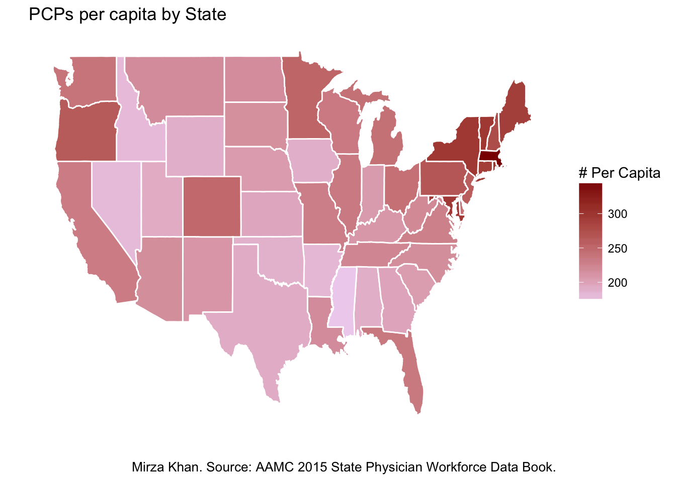
Yes, I am aware that ggplot2 is in tidyverse, but I just like knowing I’ve called it up myself.
h/t cdesante and @hadleywickham for an excellent map_data() and ggplot() tutorial